An editorial homepage anatomy reveals how a page introduces a brand without trying to explain everything. First and foremost, it sets tone. At the same time, it invites attention. From the very first moment, it signals how the brand wants to be experienced. Rather than overwhelming the viewer, it establishes presence, creates curiosity, and offers just enough to draw someone in without demanding immediate understanding.
Moreover, the strongest editorial homepage anatomy feels paced—like a well-edited magazine spread. There is a clear entry point, followed by moments of focus and rest. Nothing rushes. Nothing shouts. Each section arrives with intention and then steps back to let the content breathe. Ultimately, in design, pacing and hierarchy guide the viewer through every section.
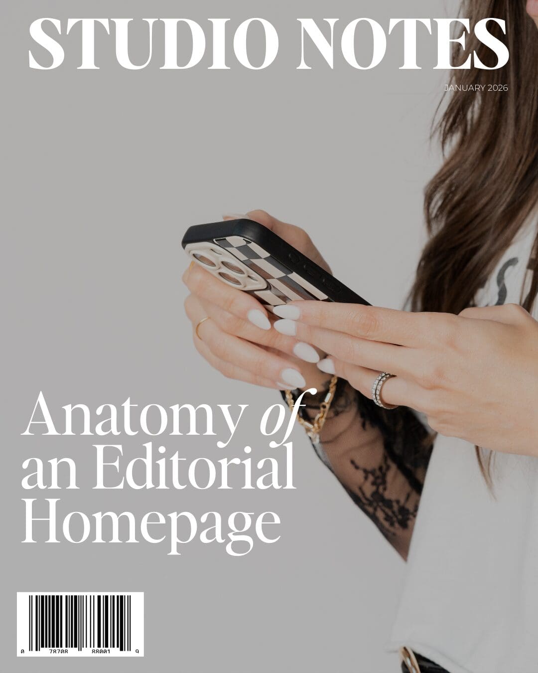
Editorial Homepage Anatomy Relies on Pacing and Structure
In well-executed editorial homepage anatomy, one message leads at a time. Consequently, the layout resists the urge to stack competing calls to action or cram every offering above the fold. As a result, the viewer never feels pressured to process everything at once.
You’ll often notice a few defining characteristics:
- One dominant message that anchors the page
- Generous margins that allow content to breathe
- Typography doing most of the heavy lifting
- Images placed with intention, never as filler
Together, these design choices create rhythm. The eye knows where to begin, and it also knows when to pause.
Editorial layouts trust the viewer. They don’t overload information out of fear of being misunderstood. Instead, they guide quietly. Scale establishes importance, spacing creates hierarchy, and typography sets mood long before a single paragraph is read.
In contrast, most conversion-driven websites prioritize volume over clarity. Endless sections, repeated headlines, and layered offers may communicate availability—but rarely confidence. By comparison, an editorial homepage communicates assurance through what it chooses not to say.
Importantly, an editorial homepage doesn’t aim to convert through urgency. Instead, it converts through authority. It shows the brand understands itself well enough to speak selectively. In other words, clarity attracts the right audience more effectively than explanation ever could.
A homepage doesn’t need to say everything.
Rather, it needs to say enough—and say it beautifully.
When pacing, hierarchy, and restraint work together, the result feels composed rather than assembled. The viewer doesn’t feel sold to. Instead, they feel invited.
And that quiet confidence is exactly what makes an editorial homepage anatomy (design) memorable.
Follow along on Instagram
Explore my work on the website
Read more of my journal entries on the STUDIO NOTES