At first glance, everything may look polished. The colors work. The fonts feel intentional. The imagery is appealing. But without visual hierarchy in design, even the most beautiful page struggles to communicate. The eye doesn’t know where to land. Nothing stands out long enough to register. The page looks nice, but it doesn’t lead.
That’s because when everything looks important, nothing is.
When everything competes, nothing leads.
Hierarchy is what tells the eye where to begin, where to pause, and what to remember. It provides direction. It creates momentum. More importantly, it turns visuals into communication rather than decoration.
Without hierarchy, design becomes a collection of elements. With hierarchy, it becomes a system.
Professional brands understand this instinctively. They don’t rely on color or ornamentation to guide attention. Instead, they use scale. Spacing. Weight. Order. Each decision builds on the one before it, creating a clear path for the viewer to follow.
Visual hierarchy in design is what creates clarity
Editorial design, in particular, lives and dies by hierarchy. Headlines lead with authority. Subheads support and clarify. Body copy settles into a readable rhythm. White space creates pauses instead of clutter. As a result, the reader never wonders where to look next.
This isn’t accidental. Editorial layouts are composed, not decorated. Every level of text knows its role. Every element earns its position. The structure does the heavy lifting long before color or imagery enters the conversation.
By contrast, most DIY brands confuse consistency with hierarchy. They match fonts. Then, they repeat colors. An finally, align everything neatly. However, without a clear order of importance, the design still falls flat. Consistency alone doesn’t guide attention. It simply repeats it.
When hierarchy is missing, even beautiful design turns into noise. The eye works harder than it should. The message loses urgency. The brand feels unsure of what matters most—even when the visuals are attractive.
Hierarchy isn’t about control.
Instead, it’s about clarity.
And clarity is what makes a brand feel considered. It signals confidence. It shows that decisions were made on purpose, not layered on out of habit or fear of leaving space unused.
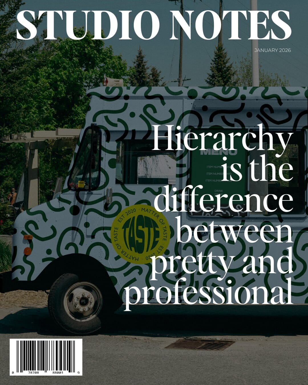
In the end, hierarchy is the difference between a brand that looks good and a brand that communicates well. And professional brands never confuse the two.
Follow along on Instagram
Explore my work on the website
Read more of my journal entries on the STUDIO NOTES